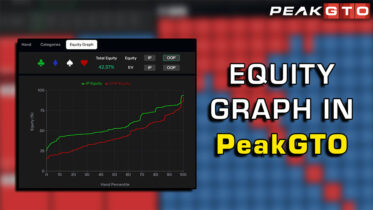
We’re constantly pushing to make game theory optimal (GTO) study more intuitive, visual, and actionable. That’s why we’re excited to introduce our newest feature: Equity Graphs — a game-changer for understanding range advantage, nut advantage, and why solvers choose certain strategies over others.
What Are Equity Graphs?
If you’ve studied GTO content before, you might already be familiar with equity graphs. Now, with PeakGTO’s new Equity Graphs feature, this powerful visual tool is fully integrated into your study process. These graphs plot the total equity of each player’s range versus hand percentile, making it easier than ever to visualize the strategic landscape of a hand.
In simple terms: Equity graphs help you quickly see which player has the advantage at any point in the hand and how that advantage shifts based on the board texture.
How Equity Graphs Help Your Strategy
Let’s break down how this tool works and how it can improve your understanding of GTO concepts:
1. Range Advantage Visualization
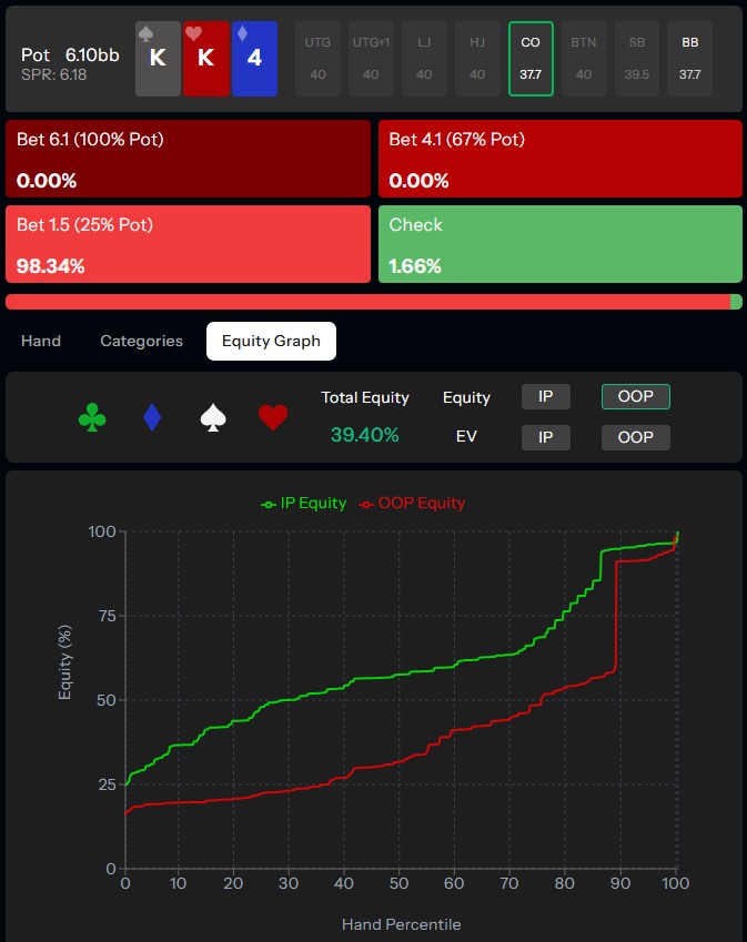
On certain boards, like K♠ K♥ 4♦, the in-position player (e.g., Cutoff) will have a massive equity edge across the entire range. The equity graph will clearly show a big gap between the two lines (Cutoff vs. Big Blind), signaling a huge range advantage.
This type of scenario is why solvers recommend a high-frequency small c-bet — and now you can literally see why.
2. Nut Advantage Recognition
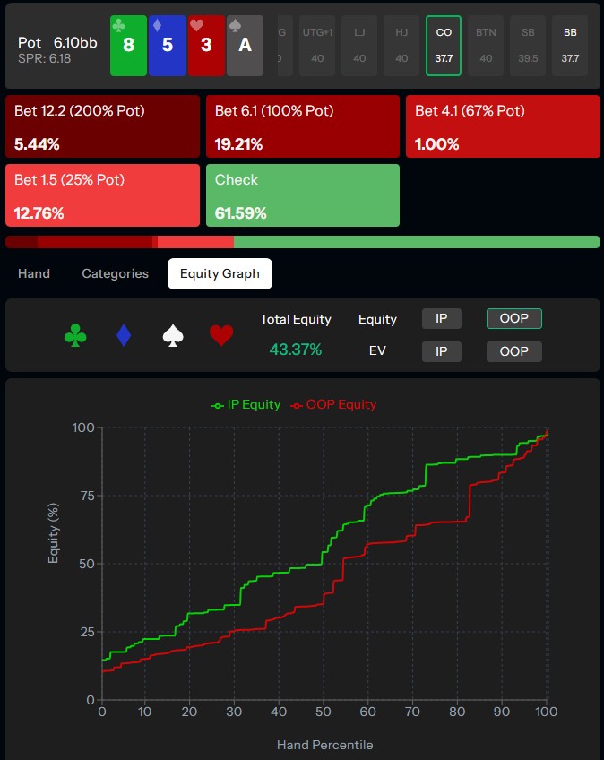
Other boards, like 8♦ 5♣ 3♠, tell a different story. Here, overall range equities run much closer together, but one player may have a clear nut advantage at the top of their poker range.
The equity graph will illustrate this dynamic, explaining why a solver prefers a polarized strategy (checking a lot but betting big when betting).

3. Understanding Turn & River Strategy
One of the coolest things about Equity Graphs is how they highlight strategic shifts on turn and river cards:
- When a turn card (like an A♠) drastically improves one player’s range, the equity graph shows a huge equity swing, signaling a high check frequency from the disadvantaged player.
- When a river card creates polarization (e.g., pairing the board or completing a straight), the graph visually explains why solvers choose big bets and jams in some spots but check at high frequency in others.
Why This Matters
Poker strategy can often feel abstract when you’re staring at a solver grid. Equity Graphs bridge that gap. Instead of memorizing frequencies, you’ll understand why certain lines are preferred — whether it’s small betting, big betting, checking, or polarizing your range.
These graphs will sharpen your ability to:
- Recognize range advantage and nut advantage in real time.
- Adjust your betting strategy accordingly.
- Build a clearer mental model of how equity distribution affects decision-making.
Final Thoughts
This is more than just a new button in PeakGTO. Equity Graphs are a foundational learning tool designed to give you deeper insight into GTO strategy — from preflop fundamentals through to the river. By making solver logic more visual and digestible, we’re helping you move beyond rote memorization and start thinking like the solver.
Check it out today in the PeakGTO library, and let the graphs tell the story behind the strategy.
